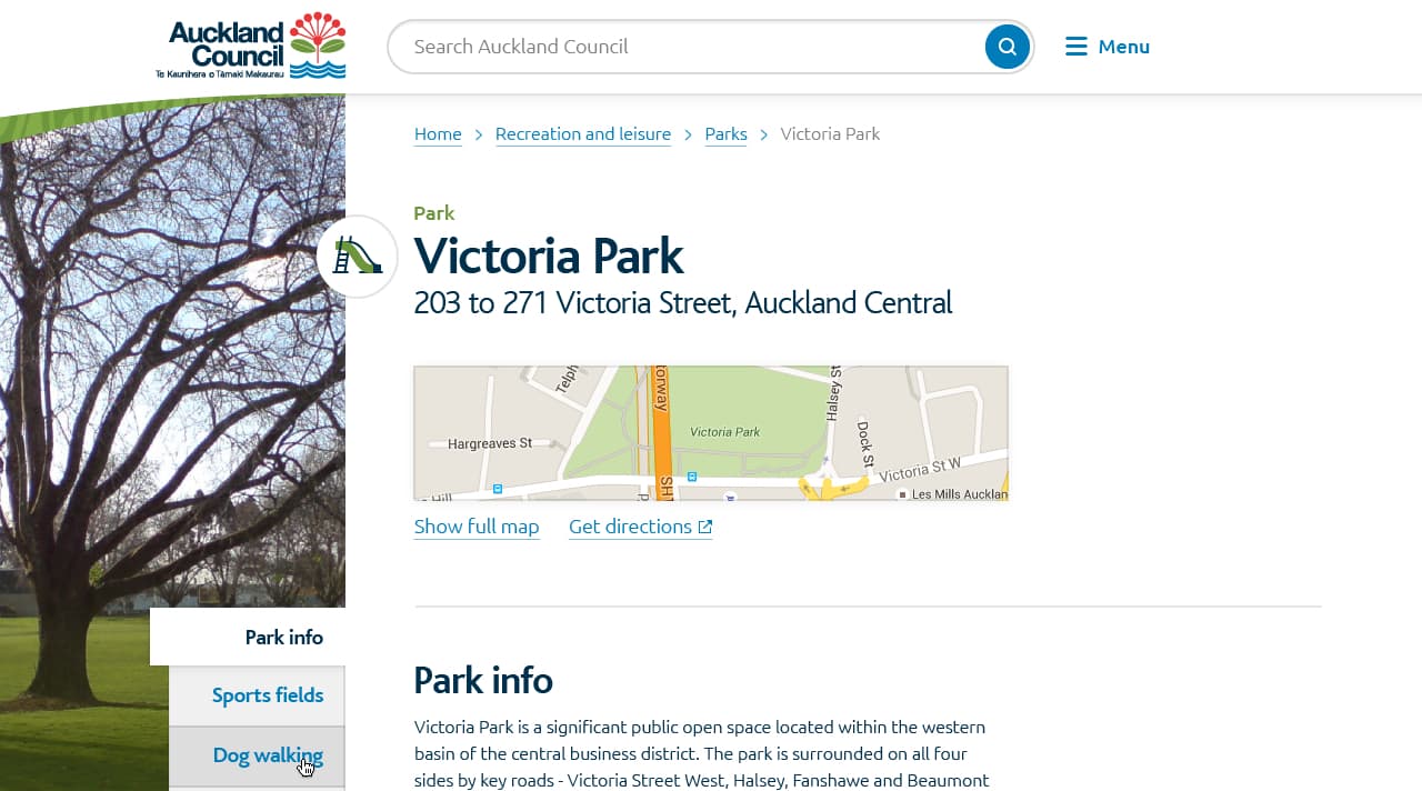
Auckland Council
UX design, UI design, icon design.
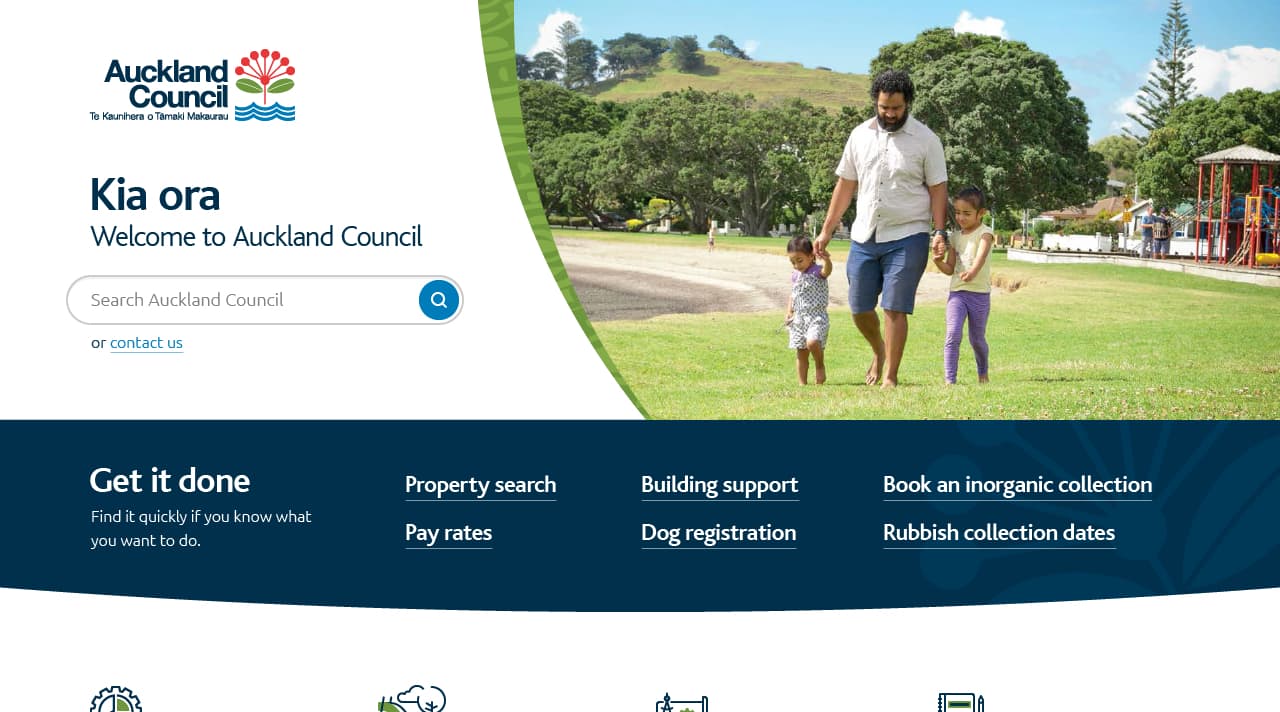
In mid 2016, the council of New Zealand’s largest city partnered with Digital Arts Network (DAN) and Goodfolk (my employer at the time) to completely overhaul their online services. DAN are a UX specialist company, and with Goodfolk’s history primarily in design, I became the bridge between the two as the in-house UX & UI expert at Goodfolk.
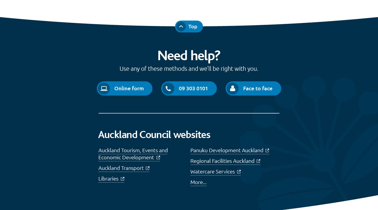
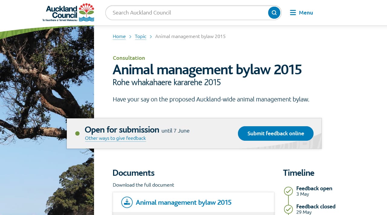
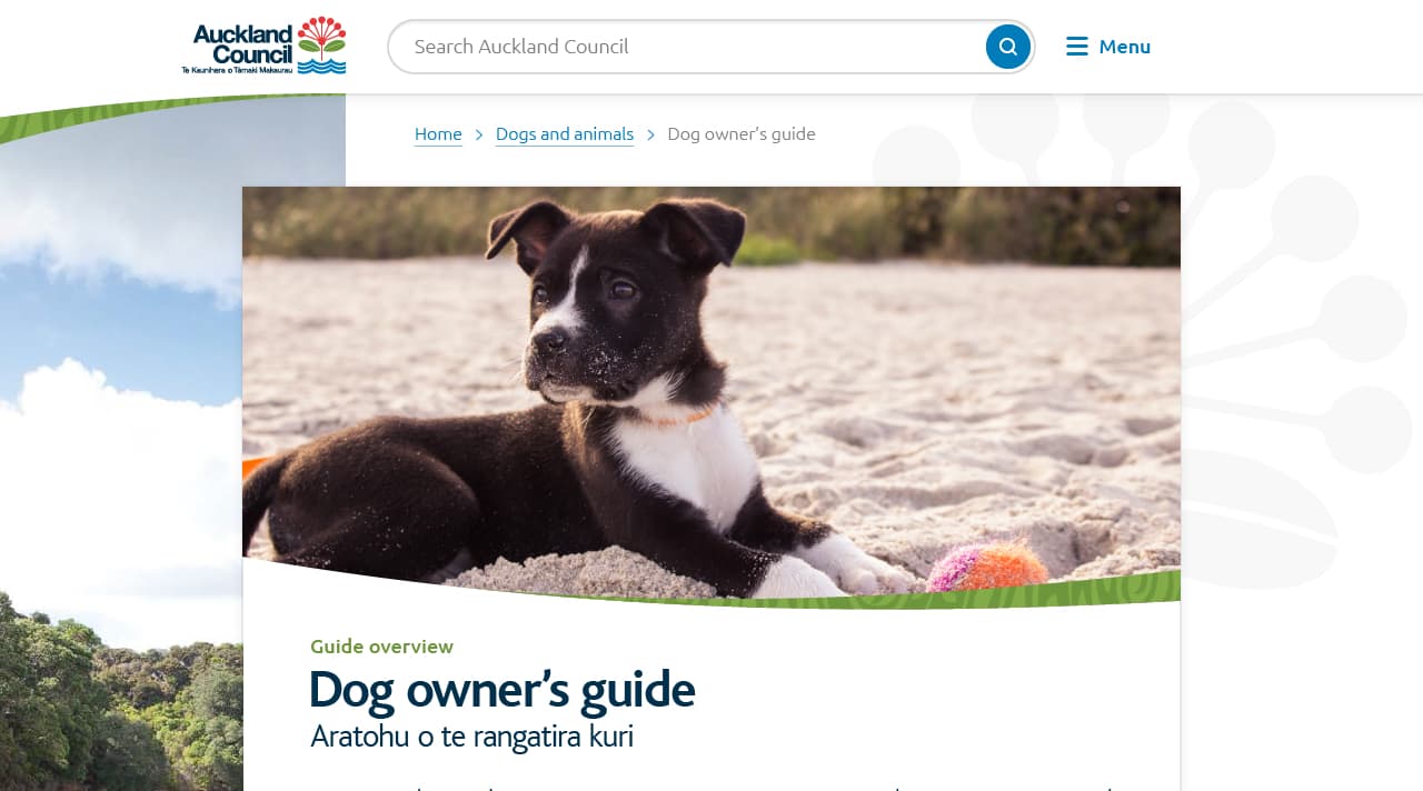
My early tasks were to create visual concepts in order to find the overarching look & feel to be used across this massive website, and to support DAN by working alongside their UX designers on-site at Auckland Council. As the project ticked on, I became the designer in charge of all visuals for the project (under my creative director at Goodfolk). I designed an extremely extensive pattern library and many page templates as I interpreted DAN’s UX solutions into the final product, and also ran quality assurance in the front-end build.
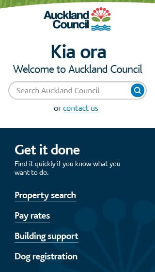
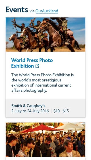
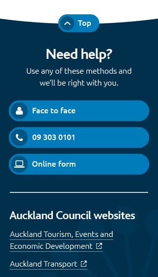
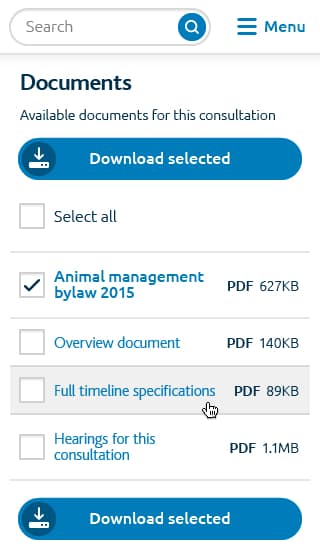
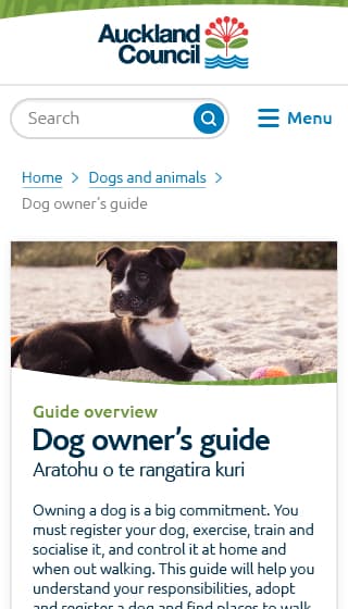
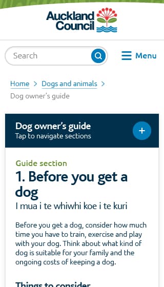
This project was long running and extensive, with the work I initially spearheaded for the main Auckland Council website extending into designs for the Auckland Council Libraries website and Dare to Explore website. I was also responsible for designing the illustrative home page icons on the Auckland Council website along with a full spec guide to allow other designers to expand the set.
